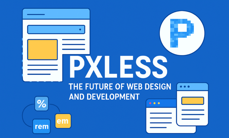
In the world of digital design and development, trends change fast, but some concepts arrive with the power to redefine the industry. One such concept is pxless. While the term may sound new to some, pxless is becoming an essential keyword for developers, designers, and businesses that want to stay ahead in creating responsive, accessible, and future-ready digital products.
This article will explore everything about pxless—what it means, why it matters, how it’s shaping web design, and what the future holds for those adopting pxless methods.
What Does Pxless Mean?
Traditionally, web and mobile designs have been created around pixels, the smallest unit of a digital screen. Designers often built “pixel-perfect” layouts, meaning everything was measured and aligned using exact pixel values. While this approach worked in earlier days, it struggles in today’s digital environment where devices come in thousands of sizes and screen densities.
The idea of pxless is to move away from rigid pixel-based design and embrace scalable, relative, and fluid units. Instead of depending on fixed pixel values, pxless methods use units like percentages, em, rem, viewport width (vw), and viewport height (vh). These units allow layouts, fonts, and components to adjust smoothly depending on the device or container.
In short, pxless means:
-
Not relying solely on pixels for design.
-
Creating fluid and flexible systems that scale naturally.
-
Prioritizing user accessibility and adaptability.
Why Pxless Matters in Modern Design
1. Responsive Design is the Standard
With billions of people browsing on smartphones, tablets, laptops, and even smart TVs, designing for a single screen resolution is no longer practical. Pxless design ensures that a website or app adapts automatically to any screen size.
2. Accessibility for All Users
Accessibility is more than a trend—it’s a requirement. Many users zoom in or increase text size for readability. If your design is pixel-locked, the layout might break. Pxless design allows elements to scale naturally, supporting accessibility needs without losing usability.
3. Better User Experience
A pxless design feels smooth and natural. Fonts resize gracefully, images fit within containers, and spacing adjusts automatically. This leads to better engagement and longer user sessions.
4. Developer-Friendly Systems
Modern CSS frameworks and tools encourage pxless principles. Instead of hardcoding pixel values, developers can rely on scalable classes and design tokens, making development faster and more consistent.
5. Future-Proofing Designs
With technology evolving rapidly, rigid designs age quickly. A pxless approach ensures flexibility, making your digital products adaptable to future devices and environments.
How Pxless Works in Practice
To understand pxless, let’s look at practical implementations in web design and front-end development.
Fluid Typography
Instead of setting fonts to 16px or 20px, pxless design uses units like em, rem, or clamp() with viewport-based scaling. This means fonts resize automatically depending on the device width, ensuring optimal readability everywhere.
Flexible Layouts
Pxless layouts often use percentages or fr units in CSS Grid rather than fixed pixel columns. For example, a three-column design may be set as grid-template-columns: 1fr 1fr 1fr, allowing each column to take equal space regardless of screen size.
Responsive Images
With pxless design, images scale to container size using relative units like percentages. Instead of fixed dimensions, developers use max-width: 100% to ensure images adjust without breaking layouts.
Utility-First CSS Frameworks
Frameworks like Tailwind CSS and Bootstrap embrace pxless principles by offering responsive classes that scale automatically. Instead of hardcoding pixels, you apply classes that adapt across breakpoints.
Pxless vs Pixel-Perfect Design
Pixel-perfect design has long been a standard in creative industries. Designers would ensure every pixel was aligned exactly as intended. While this approach still has value in some cases (like branding or print design), it becomes problematic in digital environments.
-
Pixel-Perfect: Rigid, static, and often breaks on devices with unusual screen sizes.
-
Pxless: Flexible, scalable, and fluid across all devices.
Instead of thinking in absolute values, pxless encourages relative thinking. This doesn’t mean abandoning precision—it means designing for adaptability rather than control.
Benefits of Adopting Pxless
-
Consistency Across Devices – Your design looks good on any screen.
-
Faster Development Cycles – Less time tweaking pixel values.
-
Improved SEO – Google favors mobile-friendly, responsive websites.
-
Scalable Typography – Better readability across all environments.
-
Future Compatibility – Works seamlessly with new device types.
Challenges of Pxless Design
No concept is perfect, and pxless comes with some challenges:
-
Learning Curve: Designers used to pixel-perfect methods may struggle to adapt.
-
Browser Compatibility: While most modern browsers support pxless techniques, edge cases exist.
-
Over-Scaling Risks: Without careful testing, elements may scale too much or too little.
The good news is that these challenges are minor compared to the long-term benefits. With proper testing and modern tools, pxless is easier to adopt than ever.
Pxless in Modern Frameworks and Tools
-
Tailwind CSS: Promotes responsive, relative classes instead of fixed pixel units.
-
CSS Grid & Flexbox: Encourage pxless layouts that adapt dynamically.
-
Design Tokens: Used in design systems like Material UI to maintain scalable values.
-
Fluid Design Tools: Popular design platforms like Figma and Sketch allow pxless scaling for typography and components.
The Future of Pxless
The pxless movement is more than a passing trend—it’s the future standard of digital design. As more developers embrace fluid design systems, pxless will become the norm rather than the exception.
We can expect pxless to expand into areas like:
-
Augmented Reality (AR) and Virtual Reality (VR): Where pixel-perfect simply doesn’t exist.
-
AI-Generated Layouts: Systems that build dynamic interfaces based on pxless principles.
-
Cross-Platform Development: Pxless ensures apps look great on web, mobile, and even wearables.
Read also: Lewis Hamilton Retirement Rumor: The Truth Behind the Speculation
Conclusion
The keyword pxless captures a growing movement in digital design and development—leaving behind rigid, pixel-based layouts and embracing fluid, scalable, and user-friendly systems. Pxless is not just about changing units; it’s about changing mindsets. It’s about designing with flexibility, accessibility, and future-readiness in mind.
By adopting pxless principles today, businesses, designers, and developers can create digital experiences that remain relevant for years to come.
The future is pxless—and those who embrace it will lead the next era of web and app innovation.